UIDesignMobileDesignComponentDesign
Exploring Bottom Navigation Bar Variations
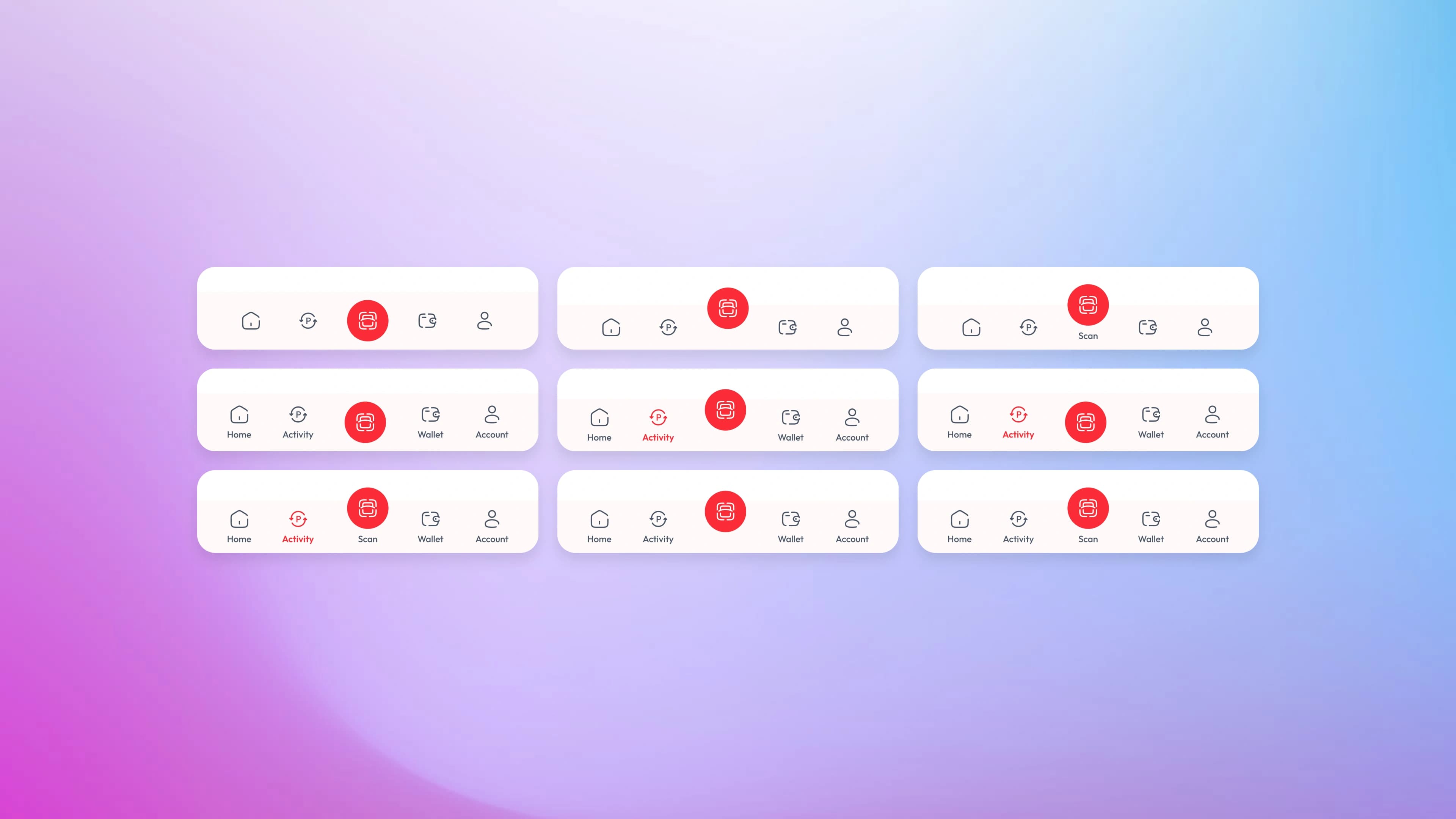
The bottom navigation bar is one of the most used components in any mobile app — yet small decisions in how it's designed can completely change how it feels to use. This project explores multiple visual variations of a bottom nav bar for a fintech-style app, covering icon treatment, label placement, active state styles, and the overall balance between minimalism and usability.
The Design Direction
The concept uses a light, minimal aesthetic with a white card surface and a strong red accent color — a common palette in fintech and payment apps. The navigation items are: Home, Activity, Scan, Wallet, and Account. The Scan action sits at the center and is treated as the primary action — elevated with a filled red circle to distinguish it from the rest. This is a deliberate hierarchy decision: the most-used action in a payment app deserves to stand out without the user having to think about it.
The Problem
Bottom navigation bars are easy to get wrong. Too much visual noise and the bar competes with the main content. Too minimal and users lose track of where they are. The active state — the one element that needs to communicate "you are here" — is often either too subtle to notice or too aggressive that it dominates the whole bar.
Variations Explored
The nine variations in this project each answer a slightly different design question:
01.
Icon only vs. icon with label
does removing labels make the bar feel cleaner, or does it hurt discoverability?
02.
Label on active item only
a middle ground where the bar is minimal by default but reveals context on the active state
03.
Active icon filled vs. outlined
a filled icon feels heavier and more decisive; an outlined icon feels lighter and more refined
04.
Active state with color accent only
using red text or red icon without any background fill, keeping the bar flat and quiet
05.
Active state with pill/background highlight
adding a subtle background behind the active icon to create a contained, card-like active state
Active State Design
The active state is the heart of any navigation component. In this exploration, three main approaches are tested:
01.
Color only
the active item switches to red (icon and/or label), everything else stays gray. Simple, low visual weight.
02.
Bold label
the active label becomes bold and red, making it readable at a glance without changing the icon style
03.
Filled background
a red circle or pill appears behind the active icon, creating a strong focal point that's impossible to miss
Details That Matter
A few intentional design decisions that run across all variations:
01.
Consistent icon weight
all icons use the same stroke weight, so no single item feels heavier than another before the active state kicks in
02.
Scan button always elevated
regardless of the variation, the center Scan button keeps its filled red circle treatment. It's the one element that stays consistent because it's the primary CTA of the entire app
03.
Label capitalization
labels use sentence case with the first letter capitalized, keeping the bar readable without feeling like a formal interface
04.
Spacing and padding
generous horizontal spacing between items prevents the bar from feeling cramped, especially on smaller screens