UIDesignMobileDesign
Redesigning the Mobile Notification Experience
The bottom navigation bar is one of the most used components in any mobile app — yet small decisions in how it's designed can completely change how it feels to use. This project explores multiple visual variations of a bottom nav bar for a fintech-style app, covering icon treatment, label placement, active state styles, and the overall balance between minimalism and usability.
The Problem
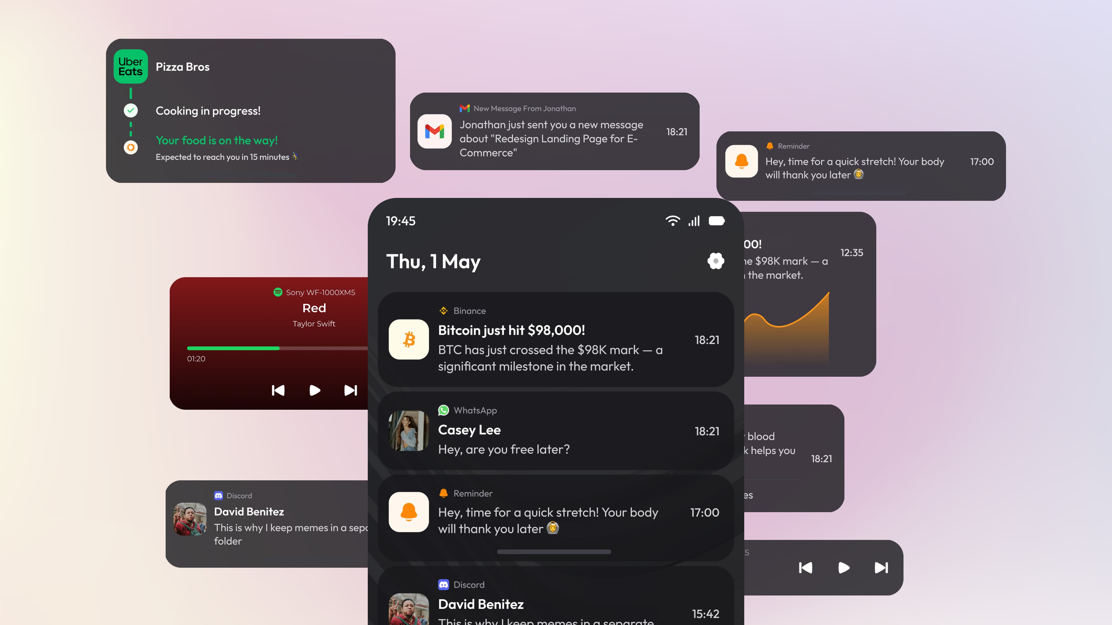
Most notification UIs treat every alert the same way. A food delivery update, a crypto price alert, a WhatsApp message, and a health reminder all look identical — same size, same weight, same layout. There's no visual priority. The user has to read every single card just to understand what needs attention and what doesn't.
The Design Direction
The concept takes a dark-mode-first, card-based approach. Each notification is a contained card with enough breathing room to be read quickly. The background uses deep, warm-tinted dark surfaces rather than pure black — making the UI feel softer and more refined without sacrificing contrast. The time indicator is consistently placed on the right, keeping the scanning pattern predictable. App source labels sit above the notification title in a muted tone, so the eye naturally lands on the bold title first.
Information Hierarchy
Each notification card is structured in three layers:
01.
App identity
small icon and source label at the top, low visual weight
02.
Main content
bold title and short description, highest visual weight
03.
Metadata
timestamp on the right, muted and out of the way
Details That Matter
A few deliberate details that elevate the design beyond a standard notification mockup:
01.
Floating card depth
cards appear slightly lifted with subtle shadow and layered surfaces, creating a sense of physical depth
02.
Consistent corner radius
all cards use the same border radius, making the layout feel unified even across very different content types
03.
Muted secondary text
descriptions and metadata use a noticeably lighter text color, letting the title breathe and reducing visual noise
04.
App color accents
icons retain their original brand colors (Uber Eats green, Binance yellow, WhatsApp green) while the card itself stays neutral — a small but effective way to aid recognition