Building a Wedding Photography Landing Page with Astro
Lumière is a fictional wedding photography studio — a concept project built to explore how a creative service business could present itself online. The focus was on building something that feels premium, editorial, and emotionally resonant, without relying on heavy JavaScript frameworks.
the implementation
Why Astro?
Wedding photography landing pages are almost entirely content — beautiful images, testimonials, service descriptions, and a few CTAs. They don't need a heavy client-side framework. Astro's island architecture ships zero JavaScript by default, meaning the page loads fast and renders immediately. For a site where the first impression is everything, that matters. Astro also encourages a component-based structure without the overhead of React or Vue, making it a clean and productive choice for static, content-heavy sites like this one.
Sections Built
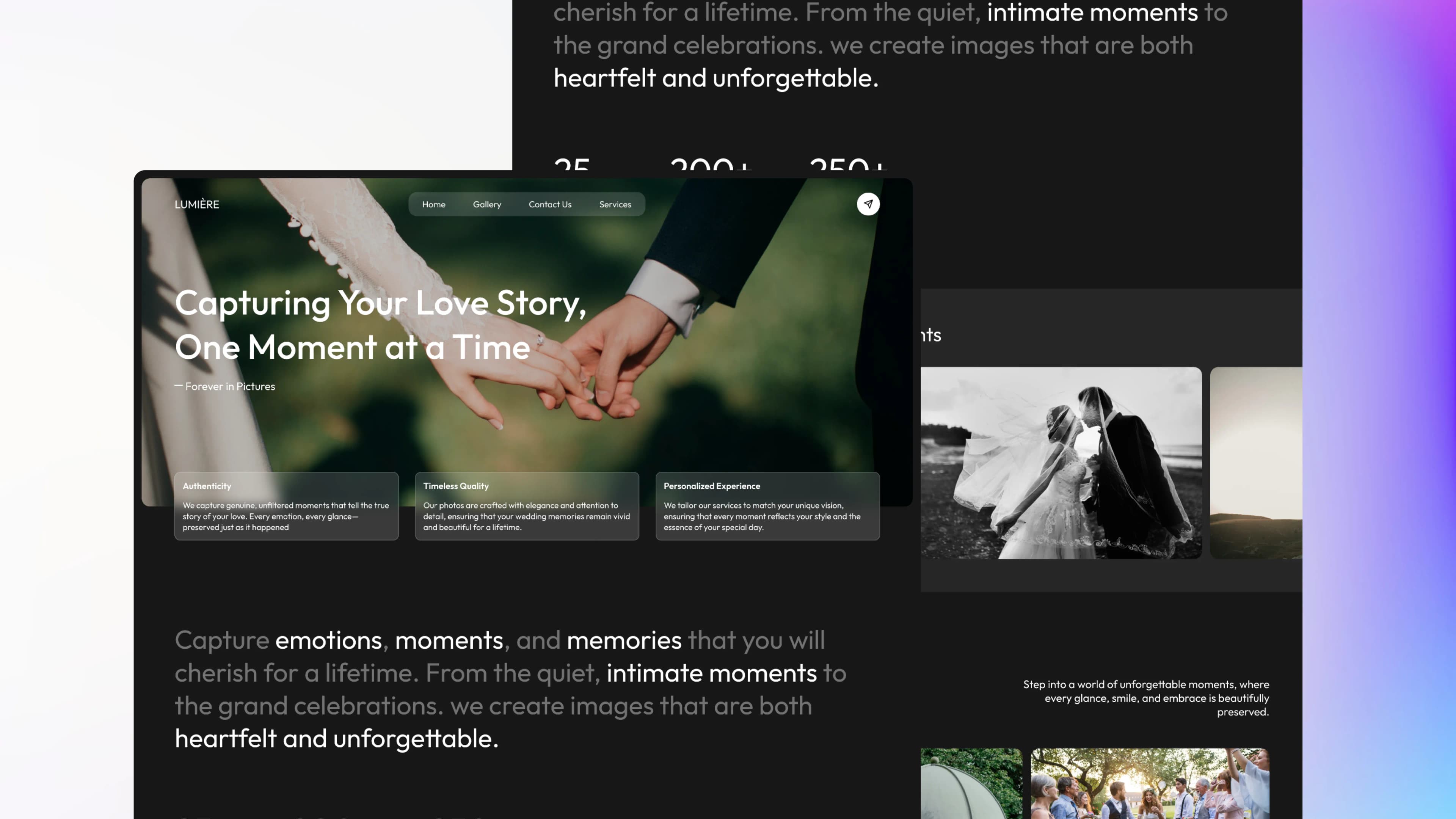
01.
Hero
full-bleed photography background with an overlay, a strong headline, a tagline, and three value proposition cards (Authenticity, Timeless Quality, Personalized Experience) anchored at the bottom. Sets the emotional tone immediately.
02.
Statement Section
a large typographic block with selective bold styling on keywords like emotions, moments, and intimate moments. Paired with three stat counters — 25 Awards, 200+ Happy Clients, 250+ Glowing Testimonials — to establish credibility quickly.
03.
Featured Weddings
a horizontal carousel-style section showcasing featured wedding stories with location, couple name, and date. Includes previous/next navigation and an "Explore All Weddings" CTA.
04.
Gallery
a masonry-style photo grid with images of varying sizes, creating a natural editorial feel. Ends with an "Explore the gallery" pill button.
05.
Awards
a clean two-column grid listing six award recognitions, presented in a minimal typographic style that adds prestige without visual clutter
06.
CTA Section + Footer
a closing call-to-action encouraging visitors to get in touch, followed by a comprehensive footer with navigation links, customer service, social media, and full contact details.
Design Decisions
The entire site uses a dark-mode aesthetic — deep near-black backgrounds, off-white text, and no saturated accent colors. This lets the photography take center stage without the UI competing for attention. It also gives the brand a premium, editorial feel that matches the wedding photography niche. Typography is used aggressively as a design element. The statement section uses selective bold and italic styling to create visual rhythm in a block of text — a technique borrowed from editorial design that makes plain copy feel intentional and crafted. The layout alternates between full-width moments (hero, gallery) and contained content sections, creating a breathing rhythm as the user scrolls down the page.
the frontend stack
Every tool chosen with purpose — from component to deployment.
Astro
for static site generation with minimal JavaScript output and fast page loads
Tailwind CSS
for utility-first styling across all pages